Editorial Design
Les Couleurs d'Urbicande
Fictional project – Supervised by Jack Durieux
Overview
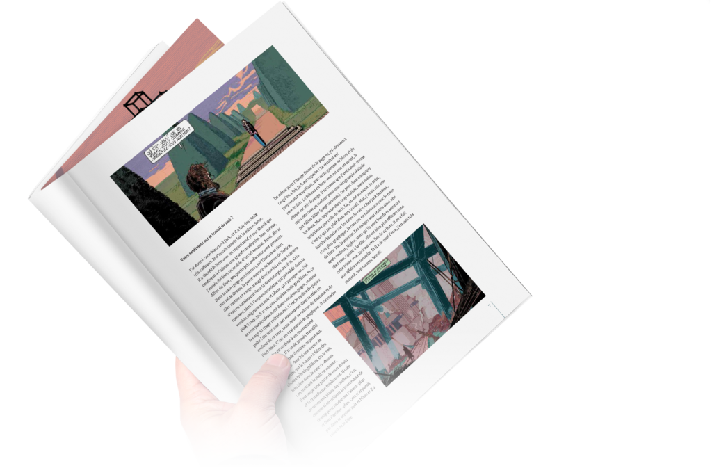
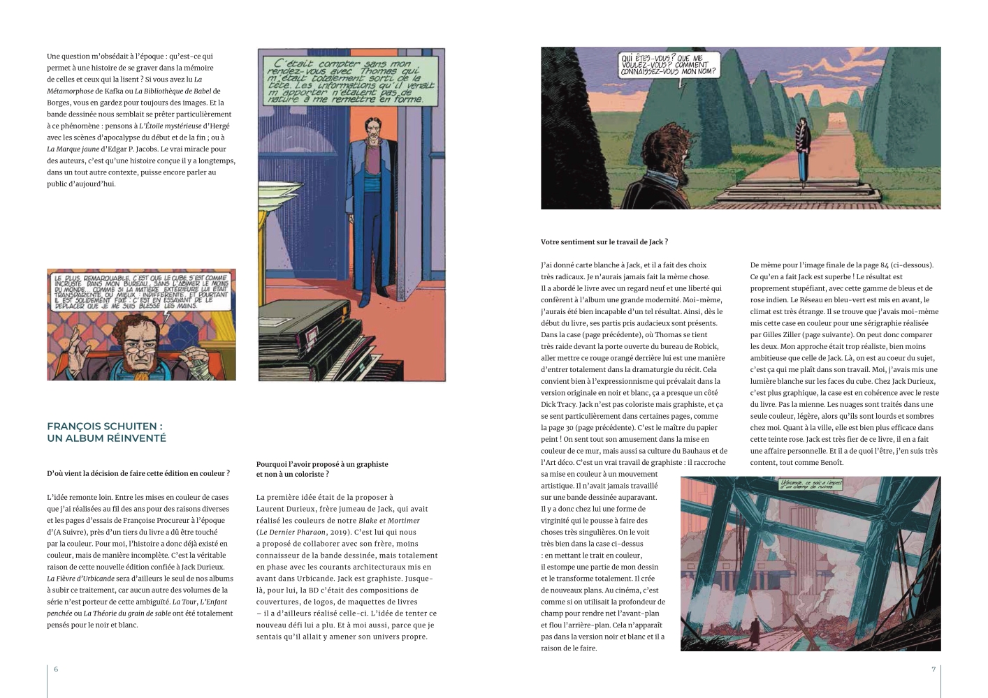
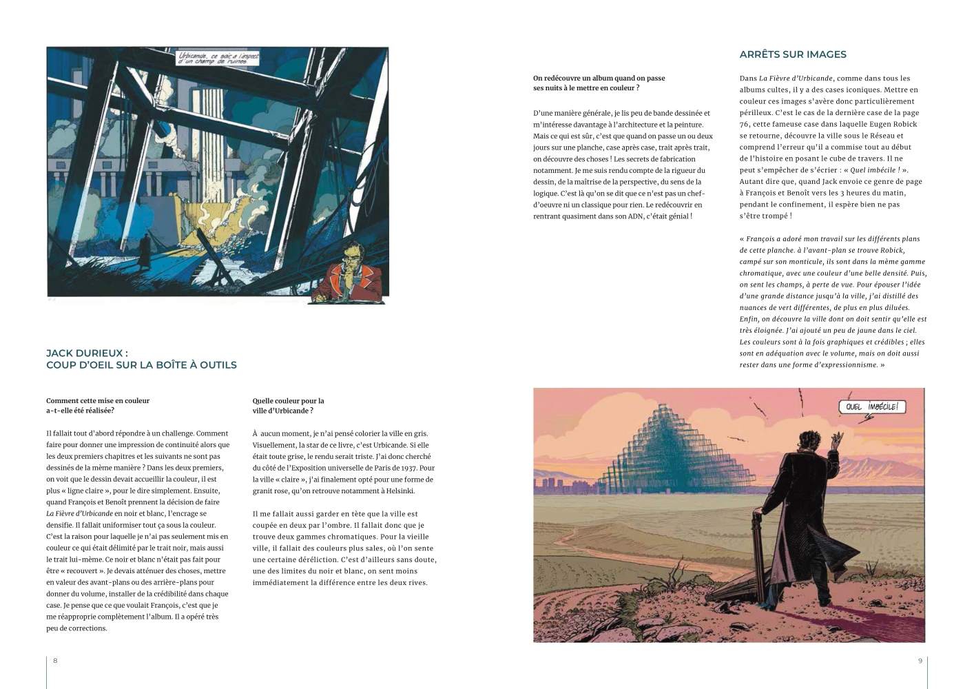
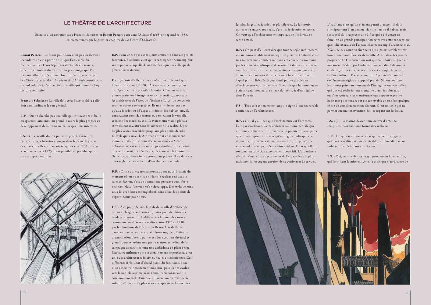
Following the success of the acclaimed graphic novel “La Fièvre d’Urbicande,” Jack Durieux collaborated with the authors to create a colorized version of the story titled “Les Couleurs D’Urbicande.” To showcase the vibrant and captivating world of the book, a magazine was envisioned to provide a deeper context and insight into the story’s creation.
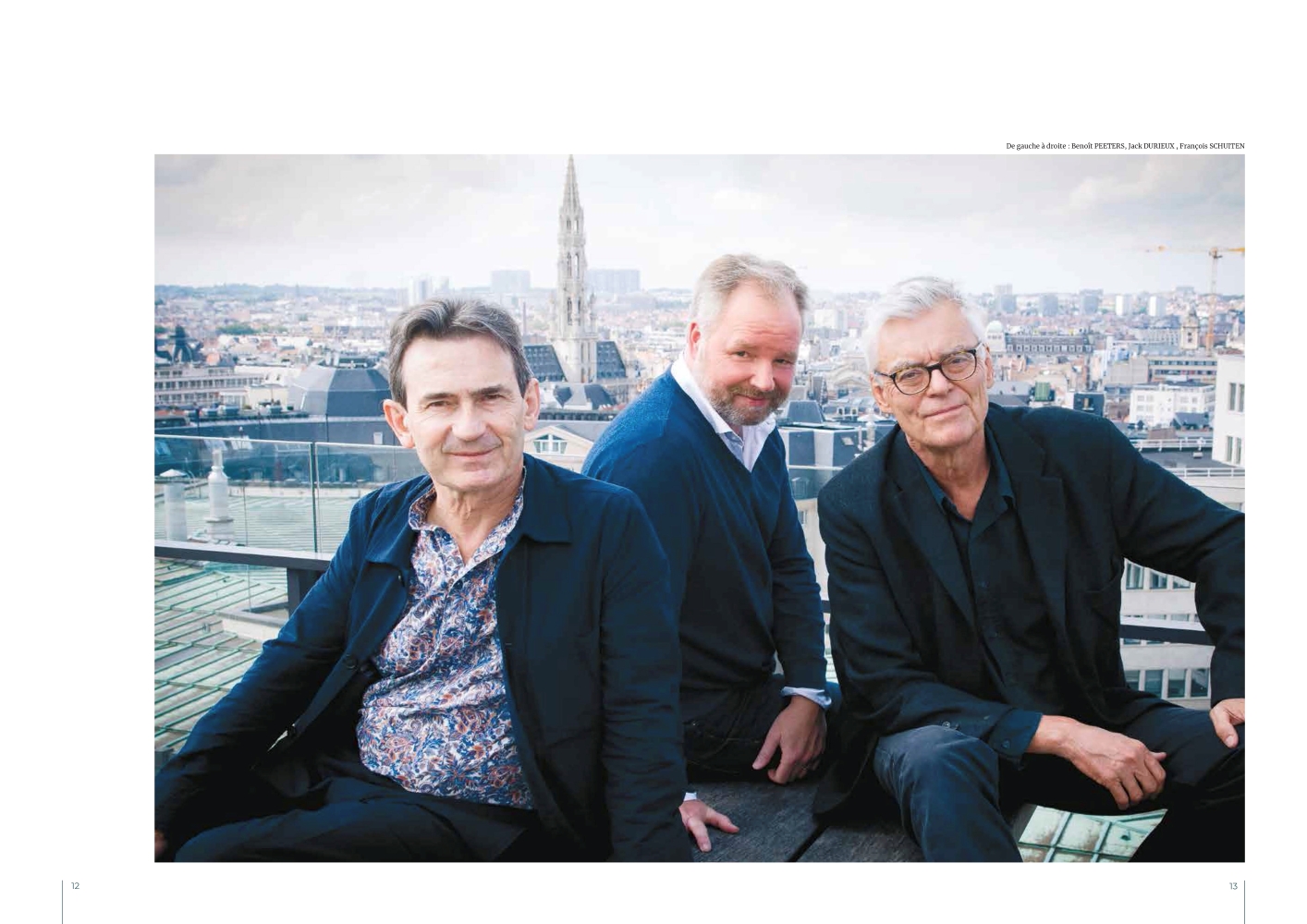
This editorial design project showcases the magazine, which features stunning visuals, exclusive interviews, and behind-the-scenes content, all of which offer readers a unique and immersive experience of “Les Couleurs D’Urbicande.”
The task
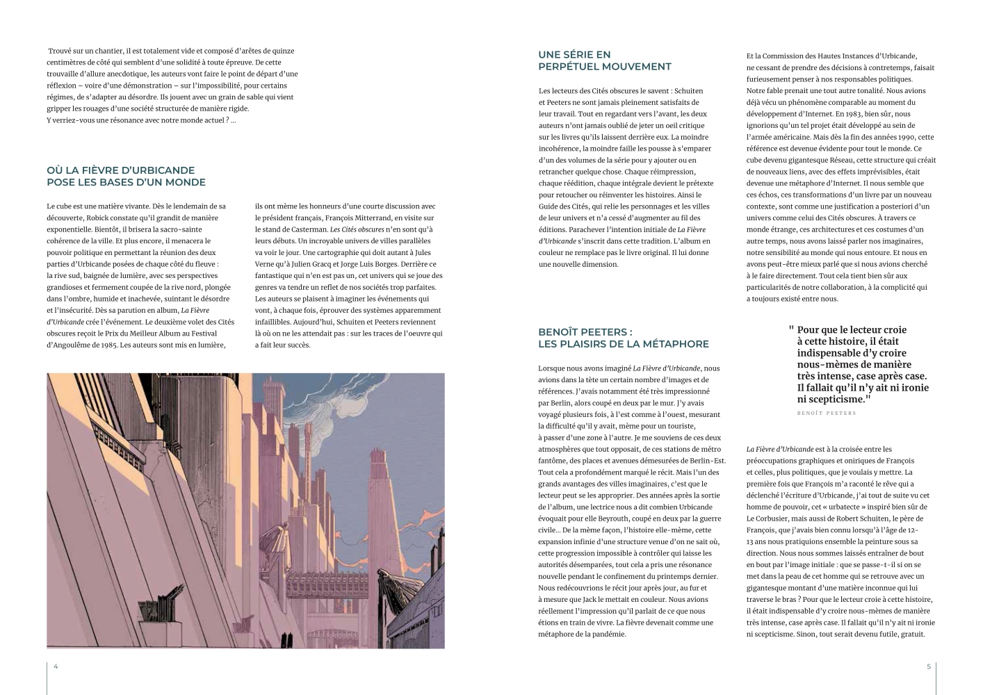
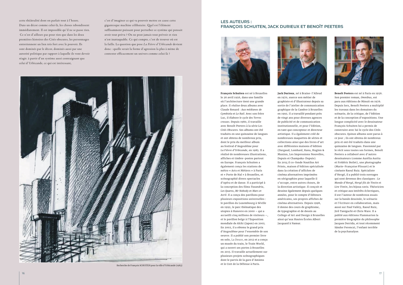
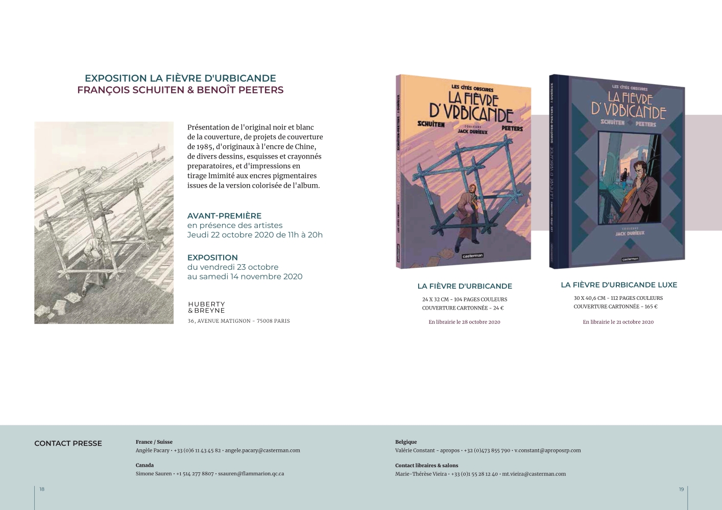
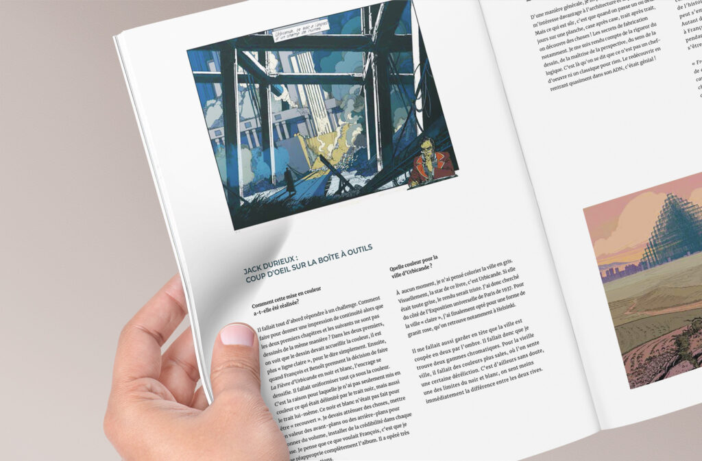
As part of our graphic design class with Jack Durieux, the talented artist responsible for the coloring of “Les Couleurs D’Urbicande,” we were given the exciting task of designing the editorial layout for the magazine. Working with provided images and text, we had to create a visually appealing and functional design that would showcase the beauty and complexity of the book’s world.
To ensure that the final product met the project’s requirements and maintained consistency, we were asked to create the magazine in an A4 format with a limited number of pages.

Approach and Methodology
My approach to creating the editorial design for the “Les Couleurs D’Urbicande” magazine involved several key steps. First, I took the time to fully understand the story and its context by thoroughly reading the text. Next, I carefully selected font pairings and a color palette that would complement the artwork and theme of the book. To ensure a consistent and balanced layout, we had to come up with a grid that would guide us in placing images and text. From there, I meticulously placed relevant images and adjusted text spacing to enhance the reading experience.



Key Takeaways
Through this project, I learned the importance of attention to detail in creating a successful and cohesive design. From selecting the right font pairings to placing images and adjusting text spacing, every aspect of the editorial design required careful consideration and precision. I came to understand that even the smallest details can have a significant impact on the overall quality and effectiveness of the design.
Through the feedback and guidance of Jack Durieux, I was able to develop a keener eye for detail and an appreciation for the value of iteration and refinement in achieving a polished final product.

Let's talk about your project.
Send me a mail
Call me

© Christophe Aldaoud 2022
Designed and built by Christophe Aldaoud


