Branding, Logo Design
Atelier Mos
Overview
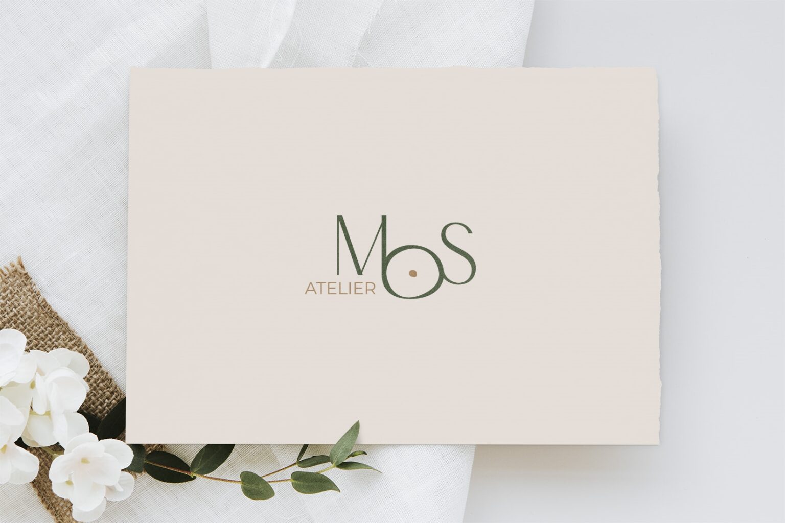
Renée Swagerman-Feijen recently launched her interior design company, Atelier Mos, and was in search of an elegant and modern logo. The word “Mos” translates to “moss” in English, which inspired Renée to look for a design that would capture the delicate yet primal essence of nature.
Winning design proposition
In search of the ideal logo, Renée enlisted the services of “Brandsupply,” an online design contest platform. Out of 78 submissions from various designers, my proposal stood out, and I am proud to say that my design was ultimately selected by Renée for Atelier Mos.
Approach and Methodology
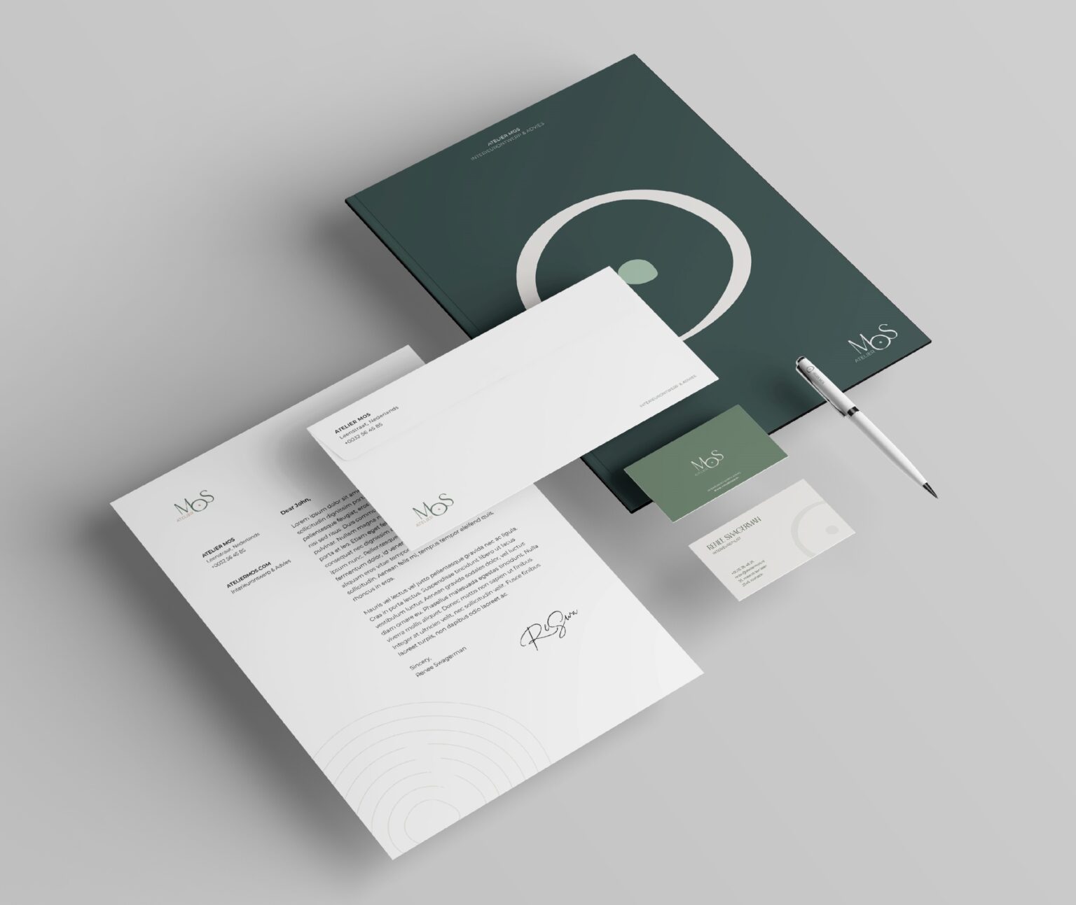
My approach to creating the perfect logo for Atelier Mos was founded on a combination of creativity, research, and collaboration with Renée. I began by exploring different concepts and designs that would align with the company’s aesthetic and values. Through continuous communication and feedback with Renée, I refined and developed the initial designs to ultimately create a logo that perfectly reflected the essence of Atelier Mos. My methodology was driven by a deep understanding of the brand’s target audience, mission, and vision, and my goal was to create a unique and timeless logo that would stand out in the market.



A recognizable icon
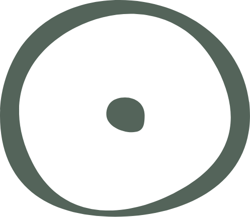
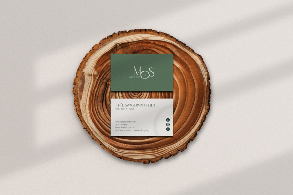
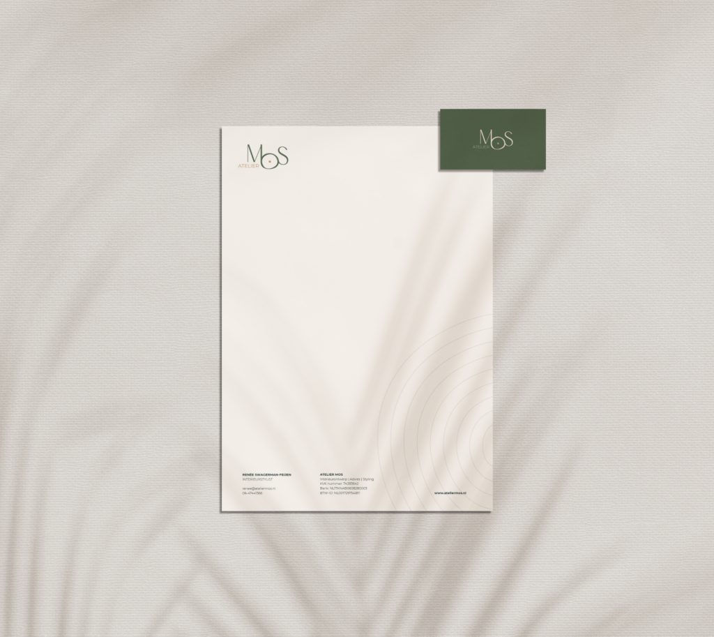
The shape of the “o” in “Mos” serves as a distinctive identifier for Atelier Mos. This design element captures the essence of moss and nature and is easily recognizable across various mediums.
Christophe delivered an out-of-the-box design with a very clear and straightforward explanation. He had clearly immersed himself well in my expectations and needs. The design was an instant hit and after some consultation it became even more perfect, if that is possible. He is patient and willing to make adjustments, thinks well with me and gives advice on what is or is not beautiful. A very nice cooperation!
Renée Swagerman-Feijen
Let's talk about your project.
Send me a mail
Call me

© Christophe Aldaoud 2022
Designed and built by Christophe Aldaoud

